
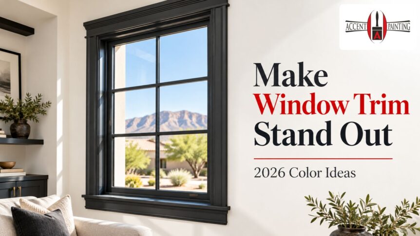
Yes, contrasting window trim colors in 2026 can look current and intentional, especially when the window has an attractive shape or sits against relatively simple walls. But contrast is not automatically better. If the room already has several competing colors, the trim is narrow or visually busy, or you want a quieter look, matching or softly coordinating the trim may work better.
The goal should be to make the architecture fit the room, not to use a trend simply because it is popular.
Why contrasting window trim colors in 2026 are getting attention
For years, white trim has been the default choice in many homes.
That is changing as homeowners become more comfortable treating trim as part of the color scheme rather than an automatic white border.
Contrasting trim can frame a view, define older architectural details, connect a window to cabinetry or furniture, or introduce a controlled accent color without repainting an entire room.
It can work especially well when the rest of the room is restrained.
In short: A contrasting window frame works when it looks connected to the room, not when it feels like a random stripe of color.
Should window trim contrast with the walls?
It depends on what you want the window to do visually.
Choose contrast when you want the window to become a noticeable architectural element.
Choose lower contrast when you want the eye to move past the trim and toward the view, furnishings, artwork, or another focal point.
For example:
- Cream walls with deep olive trim can feel warm and grounded.
- Pale beige with dark brown trim can add definition.
- White walls with charcoal trim can create a sharper graphic effect.
- Soft green walls with a slightly deeper green trim create contrast without a dramatic jump.
A successful window trim paint color usually relates to something else in the room.
In short: Contrast should have a reason. Repeat or relate the trim color somewhere else so it looks deliberate.
Contrasting trim vs matching trim vs tonal trim
Approach | Visual effect | Works well when | Consider carefully when |
Contrasting trim | Frames the window and adds definition | Architecture deserves attention, and the room palette is controlled | The room already has many competing colors |
Matching trim | Quiet and continuous | You want walls and trim to blend | You want the window to stand out |
Tonal trim | Subtle depth | You want interest without strong contrast | The wall and trim colors are so similar they look accidental |
There is no design rule saying every room in the home must use the same approach.
A living room can have dark window trim while bedrooms use quieter matching trim if the transitions are handled thoughtfully.
Is dark window trim still in style in 2026?
Dark trim remains a useful design choice, but treating it only as a trend misses the point.
Black, charcoal, brown, deep green, navy, and other dark tones can create a strong frame around windows.
They tend to work well when:
- The window shape is worth emphasizing
- There is enough natural or artificial light
- Other dark details appear in the room
- The wall color supports the contrast
- The overall design can handle a stronger line
Very dark painted window frames can feel heavy in a small room if they are the only dark element present.
Before choosing black simply because you have seen it online, test softer dark colors too. Deep bronze, brown, olive, charcoal, or muted blue may fit the room better.
When should you keep window trim the same color as the wall?
Matching the wall can be the better choice when you want a quieter interior.
This approach is sometimes associated with color drenching, where walls and architectural elements share the same or very similar color.
Matching trim can help:
- Reduce visual interruptions
- Make a small room feel less chopped up
- Let artwork or furniture become the focal point
- Modernize rooms with ordinary trim
- Simplify spaces with several doors and windows
It can also be useful where the trim itself is not a feature worth emphasizing.
In short: You do not have to create contrast simply because the window has trim. Sometimes making it visually disappear is the stronger design decision.
How does Las Vegas light affect trim colors?
Las Vegas homes can receive strong natural light, particularly around large windows and sun-exposed rooms.
That matters because paint colors can shift noticeably between bright daylight, indirect light, and evening artificial light.
A color that appears nearly black in one part of the day may show green, blue, brown, or purple undertones at another time.
For Las Vegas interior painting, test the proposed wall and trim combination in the actual room rather than choosing from a small digital image.
View samples:
- In morning light.
- Around midday.
- In late-afternoon light.
- With your normal evening lamps switched on.
Do not judge the combination after five minutes.
Live with the samples for at least long enough to see how the room changes throughout the day.
Should window trim match doors and baseboards?
It can, but it does not have to.
There are three common approaches.
Match all trim
Windows, doors, baseboards, and crown molding share one trim color. This creates continuity and is easy to understand visually.
Highlight only the windows
The window trim receives an accent color while other trim remains quieter. This works when the windows deserve special attention.
Repeat the window color selectively
The same accent might appear on a door, built-in, cabinet, or other architectural feature.
The third approach can make colored window trim feel connected without placing the color on every piece of molding in the home.
What finish should you use on window trim?
Trim often benefits from a finish that is easier to clean and provides some definition against the walls.
The exact trim paint finish should depend on the coating system, surface material, room, desired appearance, and manufacturer recommendations.
Satin and semi-gloss finishes are common choices for painted trim, but sheen should not be selected in isolation.
Higher sheen tends to make surface defects more noticeable.
That means chipped trim, rough previous brushwork, failed caulking, dents, or uneven repairs should be corrected before the final coats.
Accent Painting offers professional door and window painting as part of its interior finishing services, including the preparation needed to create a cleaner finished result.
How to choose a contrasting trim color without regretting it
Use the room instead of a trend report as your starting point.
Look for colors already present in:
- Flooring
- Stone
- Cabinetry
- Upholstery
- Artwork
- Rugs
- Hardware
- Adjacent rooms
Then decide how much contrast you actually want.
A muted green taken from a rug may feel much more natural than introducing a completely unrelated black trim.
Expert tip: Compare several levels of contrast. Test one bold option, one medium option, and one subtle tonal option next to the wall color. Homeowners often discover that their favorite is not the most dramatic sample.
When should you skip contrasting window trim?
Consider another approach if:
- The window trim is badly damaged and needs repair first
- There are too many competing accent colors already
- The room has several visually busy architectural elements
- You prefer a quiet or minimal interior
- You are choosing a color solely because it is currently fashionable
- You have not tested the color in actual room lighting
Painting trim is easier to change than replacing architectural materials, but repainting still takes preparation and time.
Choose something you enjoy living with, not something that only photographs well.
Frequently asked questions
It can. Contrasting trim draws attention to the window, while matching trim creates a quieter look. Choose based on the room's architecture and color palette.
Start with colors already present in the room. Dark neutrals, earthy colors, soft whites, muted greens, blues, and tonal versions of the wall color can all work depending on the design.
Yes, dark trim continues to appear in current interiors, but it works best when the color connects to the room rather than being used only because it is fashionable.
Either can work. Darker trim adds definition, while lighter trim can create a cleaner or more traditional contrast.
Yes. Matching or closely coordinating the trim and walls creates a more continuous look and can reduce visual clutter.
Satin and semi-gloss are common choices, but the right sheen depends on the surface, coating system, condition of the trim, and desired appearance.
Should you try contrasting window trim in your home?
Contrasting window trim colors in 2026 are a useful design option, not a rule every homeowner needs to follow. The approach works especially well when the window has attractive architecture, the room has a controlled palette, and the chosen trim color connects to other elements in the space.
If you are unsure whether contrast, tonal trim, or matching walls would suit your home, Accent Painting of Las Vegas can help you evaluate the room before work begins.
Established in 1969, the third-generation family painting company serves Las Vegas, Henderson, and surrounding Southern Nevada communities. Contact Accent Painting of Las Vegas for a free painting quote and ask about color consultation options for your window trim, walls, doors, and interior spaces.